Summer is the season when bathroom manufacturers relaunch their websites, it seems. There are a few new offerings available – and we’re reviewing the results.
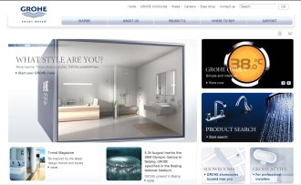
First up is tap and shower manufacturer GROHE which says its newly-launched site aims to offer readers inspiration, information and support on all aspects of bathroom design. It includes the GROHE cube – a new technology which the company says will create a realistic impression of how bathroom fittings will look in situ.
To use it you’ll need to be willing and able to use the Flash player. We also found The Cube was more problematic in the Firefox browser than with Internet Explorer. But, if you’re good to go, you can click on arrows to revolve the cube horizontally to choose between cosmopolitan, contemporary and authentic (think traditional) styles. Revolve it vertically and choose between compact, family or freedom options.
Although we have to say that their idea of compact equates to our idea of ‘bloody enormous’ and freedom is the size of some people’s entire home. Still, anyone can dream…
Next, you click on hotspots to choose which area you’d like to work on. There are hours of fun to be had here trying different styles of showers and taps and seeing how they look with the various designs. And, when you’re done, you can print out your finished work of art and keep it for future reference.
Elsewhere on the site you’ll find useful features such as hints and tips on water and cost savings, the Trend online magazine that features style advice, plus everything you could possibly want to know about the company’s product range. There’s even an eBay shop where you can check out clearance bargains.
Our verdict: This is a strong site overall. The Cube’s a fun idea with a few glitches that prevent it being as widely accessible as it might, which is a real shame. It’s a game of ‘fantasy bathrooms’ rather than something that will help you calculate how much tile grout you’re likely to need – but where’s the problem with that? We particularly liked the sea view that you get while sitting on the loo in Contemporary Compact. Unfortunately, that would possibly take a few hundred thousand more than the cost of a new suite to achieve…
In summary:
- The pitch: An unashamed shot at aspirational fantasy rather than reality that you’ll likely find either frustrating or delightful, depending on your temperament.
- Looks: A clean, contemporary site that makes good use of images – but definitely following an established design trend rather than setting one.
- Ease of use: Navigation is clear and there’s a site map. However some people can’t use the Flash player easily and we encountered problems with the Firefox browser. Text size is very small and we could not make it scale up via Internet Explorer – this is a serious black mark in the accessibility stakes. However, both images and text scaled very well in Firefox.
- Usefulness: We’d say the site scores highly here. As well as the headline Cube feature there’s plenty of product information and design ideas as well as a section on where to buy and another containing FAQs and installation guides. You can even access an eBay shop with clearance bargains.
- Realism: Absolutely not. This is about ideals, not grim reality – but that’s not a criticism, since this will be a feature that appeals strongly to a lot of users. It all depends on your requirements.
- Range: There’s a good range of products and the bathroom offerings are displayed separately from the kitchen ones, which is a big plus. You can browse by application, style or product group.
- Final verdict: 6/10 – and it’s only that low due to the accessibility issues.
* Is there a bathroom website you’d like to see reviewed in this blog? If so, drop us a line – whether you’re a reader or a webmaster, and we’ll consider it.
