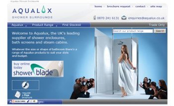
Shower manufacturer Aqualux says its summer relaunch is attracting a record number of visitors to its website. So we thought we’d join them and see what it has to offer.
According to the company, the site is designed with consumers and trade buyers in mind. It says that visitors can access comprehensive product information in an easy-to-understand format as well request a brochure for more information.
The site’s main purpose appears to be showcasing its product range and positioning this manufacturer as the obvious choice for a shower enclosure or shower screen.
Here the welcome is positive for those visitors with a run-of-the-mill bathroom who want to make the best of it, rather than the owners of a 30-metre-square luxury wetroom overlooking the Mediterranean who never have to pick their own damp towels up off the floor.
This impression is reinforced by the front-page blurb, which tells us: “Whatever the size or shape of bathroom there’s a range of Aqualux products to suit your style and budget.”
Under the Aqualux tab there’s a useful guide to choosing a shower, a FAQ section and details of the company’s warranty. Under Product Range you can see everything the company has to offer, including steam cabins, accessories and its Showerblade cleaning range. Technical details are widely available.
The last tab, Find Stockist, allows you to do a postcode search that will alert you to Aqualux stockists in your area. There are also contact details and a chance to request a range of brochures.
Our verdict: A nicely-presented site for the serious buyer researching products, but probably not somewhere to help you while away the long hours at work dreaming of outfitting your luxury holiday villa.
In summary:
- The pitch: Whatever you’re looking for, there’s something here for you. Aqualux is trying to position itself as the market leader and one-stop destination for shower enclosures and bath screens, whatever your bathroom size.
- Looks: A welcome relief from the ubiquitous white, this site uses colour and images creatively but still retains a clean look. The front page is unfussy, with details relegated below the fold and minimal reliance on Flash widgets. However, we wonder how the towel-draped woman remains so serene – hopefully all Aqualux shower enclosures don’t come with their very own press pack…
- Ease of use: This site gets marks for not making the user labour under a huge weight of Flash. Text scales well in the Firefox browser, although not in Explorer, due to the fact that fonts are set to a given size – this loses it marks. However images are titled, the drop-down navigation is clear and there is a site map.
- Usefulness: Products are sub-divided into categories using images which are handy if you’re not sure of the technical term for the item you want. You can then browse by range or type. There’s plenty of supporting information such as a buying guide and FAQ.
- Realism: Nicely-presented products are nonetheless firmly grounded in reality. This is for serious renovators rather than people looking to play fantasy bathrooms.
- Range: The site has an extensive product range in the specialist shower enclosure and bath screen categories plus details of stockists.
- Final verdict: 7.5/10 – a very strong site that’s well-designed, useful and reasonably accessible. But it’s lacking any ‘big idea’ or stunning design features to make it truly outstanding.
Previous reviews:
